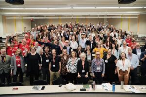
A look back at the HighEdWeb Accessibility Summit
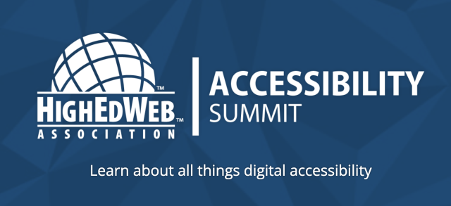
This year, the HighEdWeb Accessibility Summit took place on the 28th of July, and speaking at it, Brickfield Education Labs’ very own CEO, Gavin Henrick.
The conference, hosted by the Higher Education Web Professionals Association, focused on digital accessibility. Higher Education Institutions shared their experiences and best practices. Technical and non-technical approaches were showcased at the summit to attempt to highlight accessibility issues and raise awareness in higher education.
Operating as a non-profit event, each year, the summit relies on volunteer power and the invaluable support of its sponsors. It was great to see DubBot, Equalize digital, Localist, Momsido, and Terminalfour sponsoring the event.
Summary
This year’s edition of the summit showcased some great presentations pertaining to accessibility in our growing digital world. Presentations were pre-recorded and captioned, and the presenters were in attendance to answer any questions from attendees!
Throughout the morning, we were treated to a wide range of presentations from great speakers. Derek Jackson from Harvard University kicked off with an insightful view “The Forest Through the Accessibility Tree” turning the concept on its head where instead of missing the bigger picture when we focus on the detail, when it comes to accessibility by focusing on the detail we get the bigger picture”
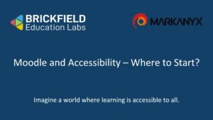
Speaking alongside our partners at Concordia University, Montreal was a
privilege. Together we co-presented a talk about two pilots of the
Brickfield Accessibility Toolkit at Concordia University.
Later there was a mix of posters presentations and longer presentations which were all brilliant. One of the poster presentations “Accessing Higher Ed Through Accessible Data Visualizations” by Elizabeth J Pyatt of Penn State caught my eye and I have summarised it later in this blog post.
Concordia Presentation
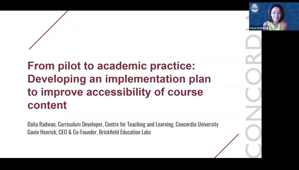
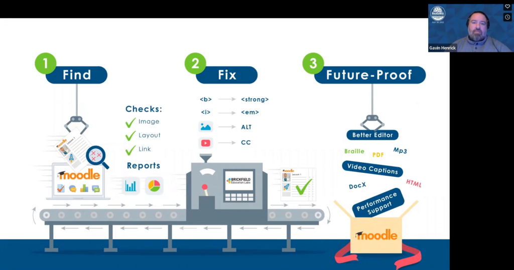
Our presentation was split into two parts. Dalia Radwan, Curriculum Developer,
at the Centre for Teaching and Learning for Concordia University, took the first session, Gavin took to the virtual podium for the second half. Concordia University used Brickfield’s Accessibility Toolkit plugin and used it in their Moodle learning management software. Our partnership with Concordia resulted in two different rollout plans.
In part one, Dalia detailed the two pilot studies, including their purpose, design features, procedures, empirical findings, and resulting recommendations. Gavin led part two of the session, where he outlined an institution-wide accessibility rollout plan. Contained in the latter part were the different Key Performance Indicators.
UAlbany's 8-Day Web Accessibility Challenge
Presented by Emily Masters, Web Specialist in the Office of Communications and Marketing at University at Albany, SUNY. This excellent presentation reviewed and introduced the 8-Day Web Accessibility Challenge held by University at Albany’s Web Services in January 2022. It was a synchronous email-delivered training program, which among other goals, it aimed to improve confidence and skill in the basic accessibility principles.
“Framing web accessibility efforts through an exclusively compliance heavy lens misses the mark.” explained Emily’, “We cannot forget that this work impacts real humans in real ways.”
Emily Masters – HighedWeb 2022
The 8-day challenge ran over 3 weeks, with two weeks of content, and then a week to catch up and finish. The schedule of topics ran as below:
- Day 1: Introduction
- Day 2: Using Structured Headings
- Day 3: Creating Accessible Tables
- Day 4: Writing Descriptive Links
- Day 5: Adding Alt Text to Images
- Day 6: Using Colour Carefully
- Day 7: Using Clear Language and Design
- Day 8: Reflection
In Week one, the first 4 topics were sent out, and on Friday they had a zoom drop-in session. Week two followed the same format and week three was used as a buffer zone to wrap up.
The introduction and reflection days allowed them to run an entry and exit quiz where they tested knowledge of the basic accessibility concepts.
Participants received a structured daily email introducing a new topic, explaining the context and the why the topic was important such as:
- What is alternative text?
- How do we write alt text?
- Are there other benefits of alt text?
- Watch Todays Video
- Take Todays Quiz
Each email was not too long and to the point with a simple message so as not to overload the participants. This email acted as a learning nugget to encourage the buy-in of the user into the concept of accessibility with about 30 minutes or less of effort each day.
Well done to the team at University at Albany, SUNY/ for what was an
excellent example of an effective awareness building programme and
presentation.
The 8 day challenge emails and videos are online on the web services accessibility section of University at Albany, SUNY/.
Accessing Higher Ed Through Accessible Data Visualizations
Presented by Elizabeth J Pyatt, IT Accessibility Consultant at Penn State University, this poster presentation focused on some tips for making the user of Charts more accessible.
There was three Chart Accessibility Guidelines
- Colour Contrast
- Supplement Colour Coding
- Long Description
Elizabeth’s first tip was Colour Contrast. Making sure that all lines, shapes and the text in any chart have sufficient contrast with the background. Elizabeth used the Paciello Colour Contrast Analyser for this showing how this can be covered in different ways. Using Dark Mode backgrounds with a light colour or making the light colour darker to increase contrast on a white /light background or adding a black outline around the shapes were just some of the suggestions.
The second tip was to Supplement Colour Coding. This is where you use not “just” colour, but also labels, shapes or textures to identify different aspects. This is a topic I love. So many times, graphs do not survive printing (in black and white, who prints in colour?) . One of the solutions was to add strategic labels to the graph. For example, to specific pie regions, to use clear black boxes and white text. Another example given in attempting to supplement colour coding was to use different textures for lines in a line graph.
The third item Elizabeth covered was Long Description – to provide a full description for people who cannot see the graph and people unable to understand it or interpret it. So for example, in a text description, it is possible to use lists, with names and values, or use an accessible table (like Moodle has)
Some final thoughts
I loved the email idea. The novel use of a short simple email as the method to engage staff who otherwise may baulk at engaging in enforced training or going into a training site. Recalling a communication lecture, I attended years ago; I was taught the importance of engaging people in the communication channels that they use and not your own desired channel. UAlbany did this perfectly. It is one of the core beliefs here at Brickfield Education Labs too.
In many ways, this foundational level approach reminds me of the excellent work by Helen Wilson of Worcestershire County Council, on the SCULPT guidance framework for underpinning accessibility awareness.
This awareness building campaign is also very similar in nature to what we recommend to our clients to run over a year, with a monthly focus on one area (such as Images). However, in University at Albany, SUNY, they ran their topic-based challenge over 8-days, in a three-week period.
The session on graphs is a great reminder of the importance of accessibility in the use of graphs. Having them look pretty is one thing, however supporting everyone in understanding the graph data and its meaning is key.
I look forward to the 2023 Accessibility Summit and learning more great ideas and sharing what we do. At Brickfield, we hope to sponsor next year!