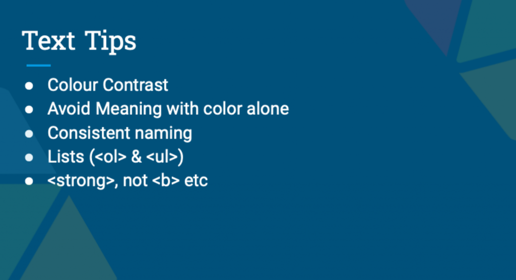
Key Accessibility Tips: Text
This blog post is an extract from our GAAD webinar. Here is one of Gavin’s 7 tips for improving accessibility in your Moodle courses.

Colour Contrast
How important is colour contrast? It is not until there is poor lighting and sight issues that colour contrast becomes a more obvious hindrance to accessible content. WebAIM has a great Contrast Checker to help you check the colour contrast between two colours to ensure it is accessible for all learners.
Avoid Meaning with Colour Alone
Try to avoid creating meaning with colour alone. Although it is common to use colours such as green and red for meanings, this is something to avoid unless the meaning is also conveyed by the content itself in words such as yes or no. You should also think about when material may be printed out in black and white, how it might look.
Consistant Naming
Be consistent when naming. Simple and effective naming is key. Frequently website pages show links directing to a presentation or slides, if you have seven or more links on a page called slides, this is consistently bad and lacking context. Consistent naming implies text such as ‘Week 1’, ‘Week 2’, etc. Don’t call every Powerpoint “Presentation1.pptx”.
Lists (<ol> & <ul>)
Use different types of lists to group information according to its nature to provide orientation for users.
<strong>, not <b> etc
Semantic HTML means using correct HTML elements for their correct purpose as much as possible. Semantic elements are elements with a meaning; hence use <strong> instead of <bold> for text with extra weight meaning.


