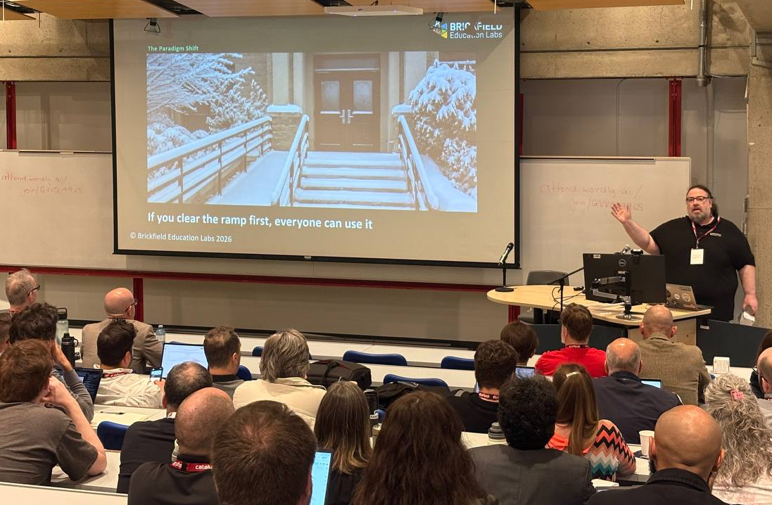
Designing Course Content for Autistic Learners

This week marks World Autism Acceptance Week, taking place from 28th March to 3rd April 2022.
According to The National Autistic Society, there are over 700,000 autistic children and adults in the UK.
April has widely been known as “Autism Awareness Month” as a way to empower autistic individuals and their families. Today, the Autism community is calling on people to shift their language to match the growing need for acceptance within the community.
World Autism Acceptance week is overlapping with The United Nations ‘World Autism Awareness Day’ which will also be celebrated today, April 2nd.
Designing content for autistic learners
Here are some tips we share with our clients for creating a more inclusive and effective learning Moodle course, specifically for autistic learners.
It is critical to not create barriers for those accessing your courses. Creating accessible content benefits all users.
Plain language, please
Use clear, concise and direct language when providing content. Keeping sentences short it makes them easier to digest.
- Language should be free from abbreviations, jargon, metaphors and idioms and acronyms where possible – explain the word, or provide the definition.
- Avoid words or expressions that have more than one meaning.
- Correct spelling and grammar are very important.
- Provide clear instructions and clear feedback in all activities. The learner should not have to guess what to do.
Writing in plain language opens your content to all learners.
Here are some good posts on the use of language:
Simple colours are key
When it comes to using colours on your website, muted tones of greens, blues and oranges are a great choice as these are calm colours. These colours have much shorter wavelengths than brighter colours, meaning much less stimulation and therefore
Softer tones of greens and blues calm the feeling of chaos and often soothe people who have various sensory conditions, including autism.
Using bright, contrasting colours can heighten the sensory overload of autistic learners, disrupting their learning.
Use simple sentences and bullet points
Long walls of text can prove difficult for everyone to read. When scanning the content, structure is so important. Some key points include:
- Structure the content with headings and subheadings.
- Break up long content by using paragraphs.
- Introducing numbered lists and bullet points.
- White space on either side of the content is good. Having a line of text across the whole screen makes it harder to read and scan from line to line.
These help format your information for the reader and enables them to find the information they want faster.
You can also offer alternative extra ways of consuming the information.
Links and buttons should be descriptive
Link text should be descriptive and accurate so that people know what to expect before they select the link or button. The link should describe the content and destination of the URL.
- Avoid using Click here – where is here after all and not everyone is clicking!
- Avoid using the URL as the link text – the name of the site or webpage you link to would help those reading and those listening to a screen reader
- Avoid opening a link in a new window, as this can create confusion and anxiety for the user. This breaks the back button which is the most used feature in browsers. This is important for screen-reader accessibility too.
Here are some good posts on making great links:
- How to write better link text for accessibility – By Bigback.
- The perfect link from A11y Collective.
- Key accessibility Tips for Links – Brickfield Education Labs.
Build simple and consistent layouts
For online courses, use a consistent layout throughout your courses. Each course should be consistent in these areas.
- Navigation – don’t make each course different to navigate, reduce stress in guessing where things are – week 1 lecture slides should be in the same place in every course.
- Appearance – consistent appearance builds familiarity and reduces anxiety for all users. So stick to one Moodle course format.
- Behaviour – Doing the same action on different areas should have the same results.
- Don’t restrict font size changes on your site. The page and site should work with people increasing the font size with the browser controls or if they simplify the styles.
- Use suitable icons to aid navigation.
Remember to avoid busy layouts with a lot of stimuli as this can heighten sensory awareness and create an overwhelming learning experience. It is most important to avoid movement or animated page elements that can distract.
Here are some good posts on making great layout:
Avoid time constraints on activities
Where possible, activities, quizzes, and assignments should not be strictly time-sensitive as this can lead to people becoming anxious or overwhelmed by the task.
In Moodle, it is possible to override the assignment and quiz timings for an individual user, or a group of users so they have different time starts, finish times and submission times.
Of course, designing your activities and assessments to avoid this type of stress is also possible.
When it comes to quizzes, providing a practice quiz to help people familiarise themselves with the quiz system and how it works will help reduce stress.
How you can get involved
There are a lot of events taking place on April 2nd and throughout the month of April. Here are some events that you can take part in.
- Inclusive Quality Education for All – April 8th Virtual Event
- Download the media pack – World Autism Acceptance Week!
- Workplace information and fundraising pack (PDF Download)
You can also join in on Twitter with the hashtag #AutismAcceptance and #AutismAcceptanceMonth!

Some useful resources
- BOIA – How Web Accessibility Affects People With Autism
- The Big Hack – Designing for People on the Autism Spectrum
- UN Observances – World Autism Awareness Day
- Irish Society for Autism – World Autism Awareness Day 2022
- Download the poster for Designing for Learners with Autism (PDF).
- UK Home Office Posters on designing accessible services for different users.